Stilentwicklung Stadtwerke München (MVG)
Designing a fare plan that is accepted by all passengers is a significant challenge. With the fare reform of the Munich Transport Corporation (MVG), many things are intended to become easier for the passenger – for this to happen, the old structures that have been ingrained in the minds of Munich residents for a long time must give way to the new fare system. My goal in the design was to support this process with a suitable illustration style. Taking into account the guidelines, we developed a style that conveys the messages of the Munich Transport and Tariff Association (MVV/MVG) to the passenger in a modern and authentic manner, with a high degree of recognizability.
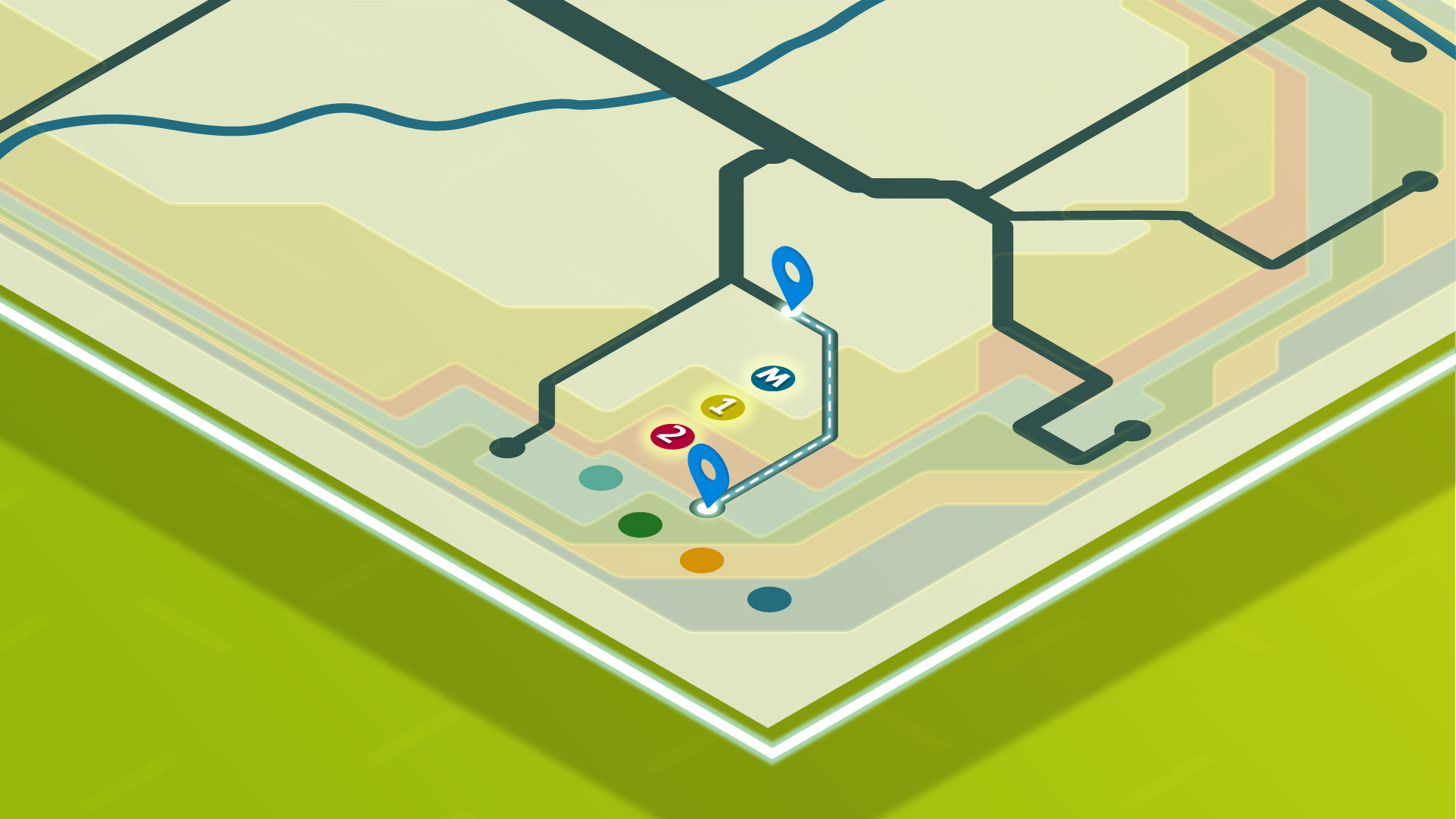
The green background appears fresh and new through subtle color gradients, while delicate structures overlaid support the spatial perspective and give the illustrations more stability. The isometric perspective (parallel perspective) makes elements appear three-dimensional and thus provides optimal conditions for the spatial representation of routes and pathways.
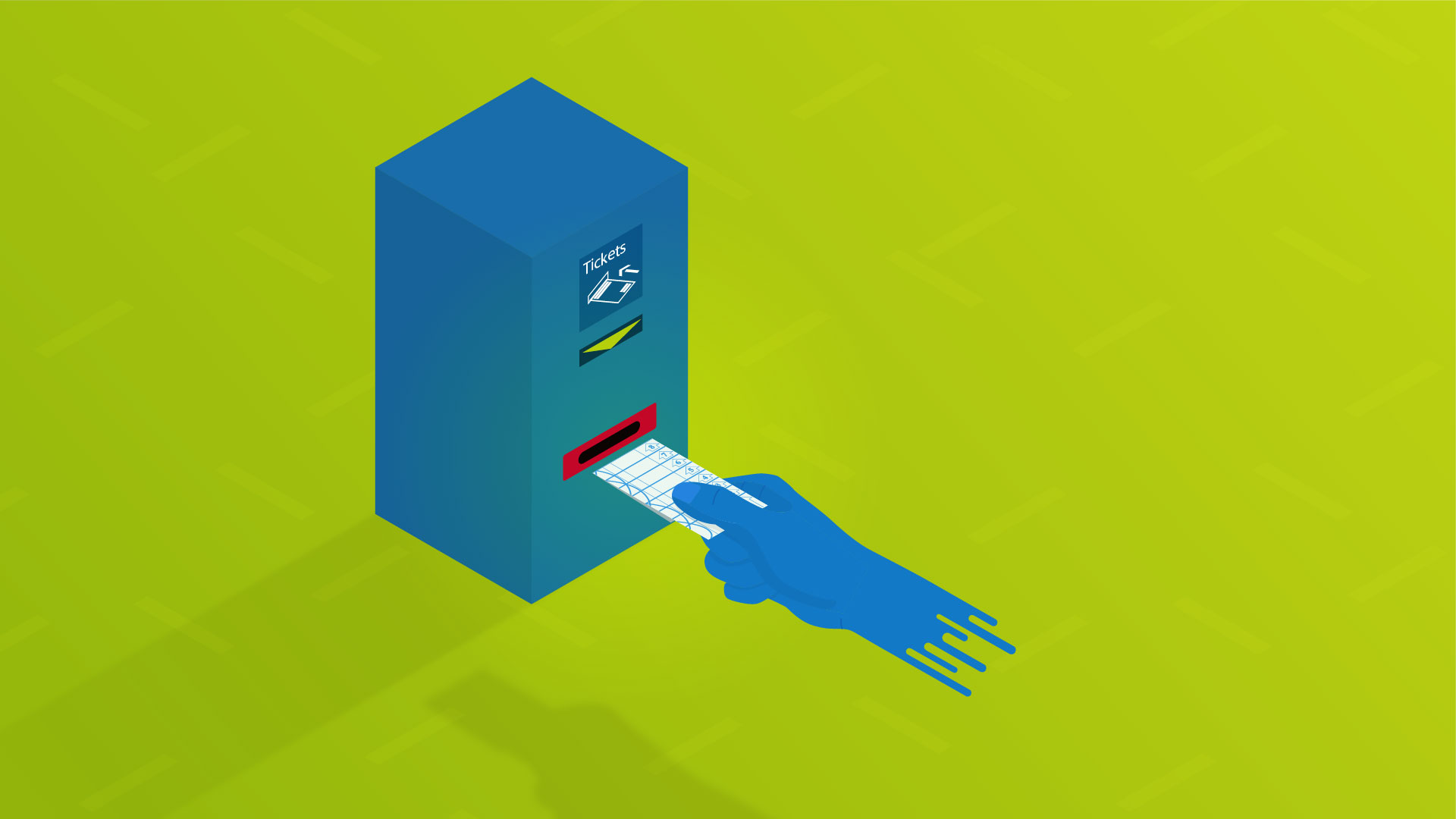
During the briefing meeting, there was the idea of tracing along maps and fare plans with a finger. From this idea emerged a hand that, through its organic, realistic forms, represents the passenger. By using the MVG blue color instead of skin tones, the entire target audience is still addressed.
To highlight the new zones, routes, or other elements, a glow was added to help differentiate them from background elements. To further increase the recognizability of the new network plan, the final film features a color-accurate version of the network plan at the beginning of the videos in a two-dimensional representation.


