Sustainability - Illustration und Interface-Design
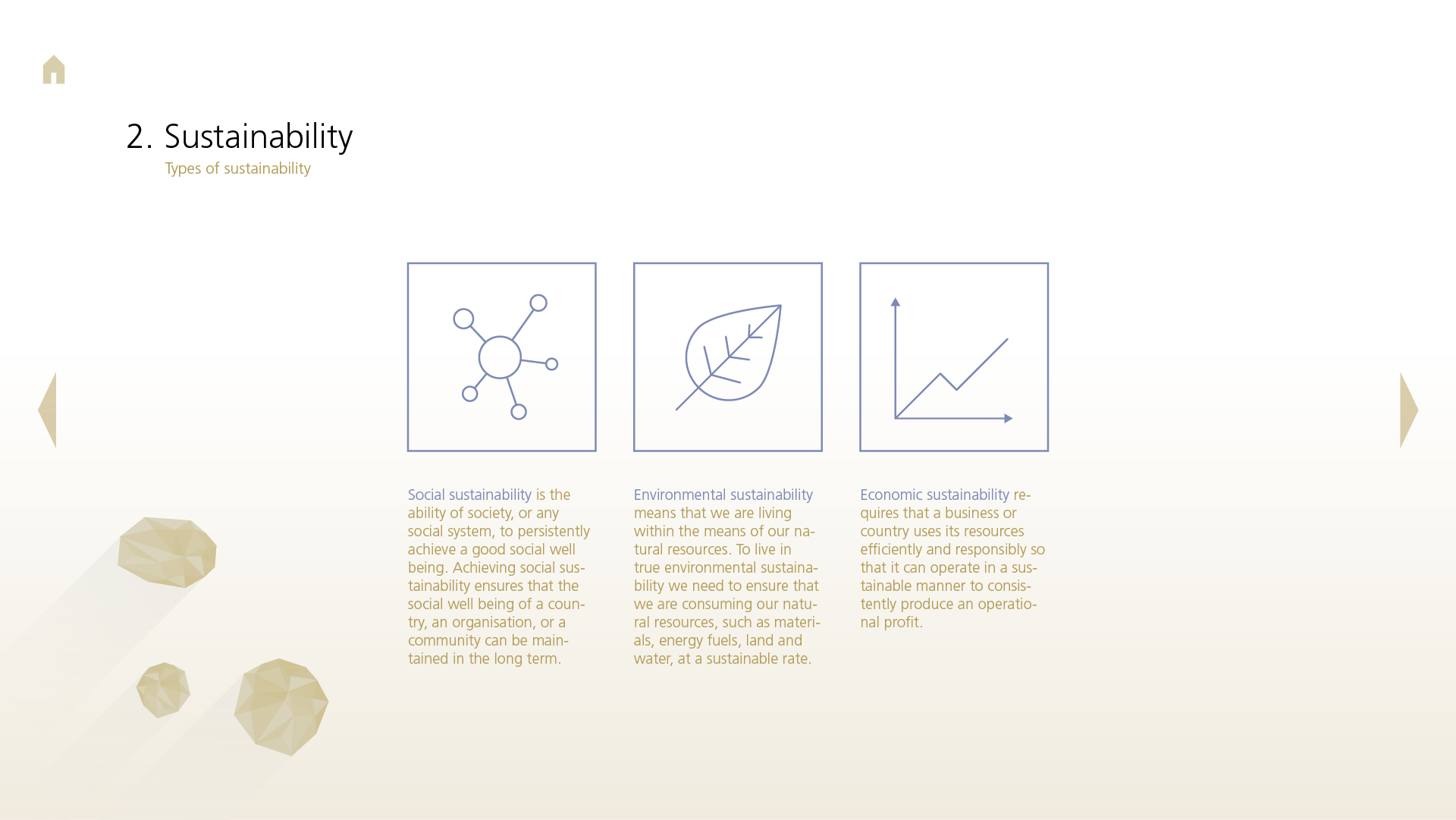
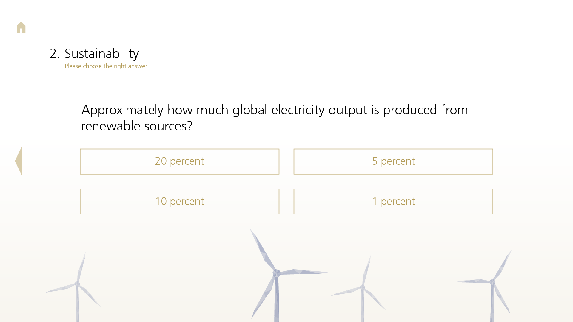
In developing an e-learning module for a Liechtenstein financial services company, my goal in the design was to translate the brand identity into an illustration style, ensuring the company’s recognizability while closely linking the visual style to the content of the training on sustainability. The traditional and reputable company emphasizes values such as trust, competence, and commitment and aims to contribute to climate and environmental protection through sustainable investment strategies. Employees were to be trained specifically on this topic.
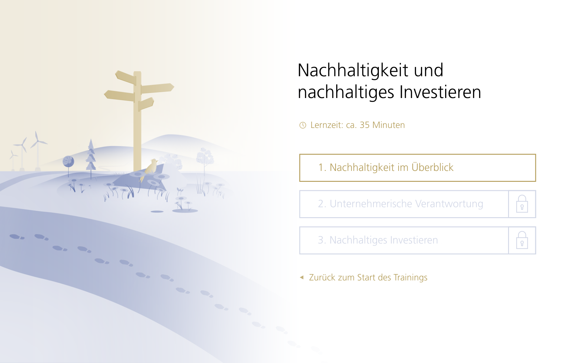
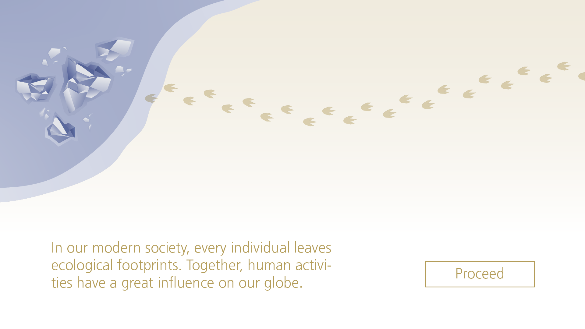
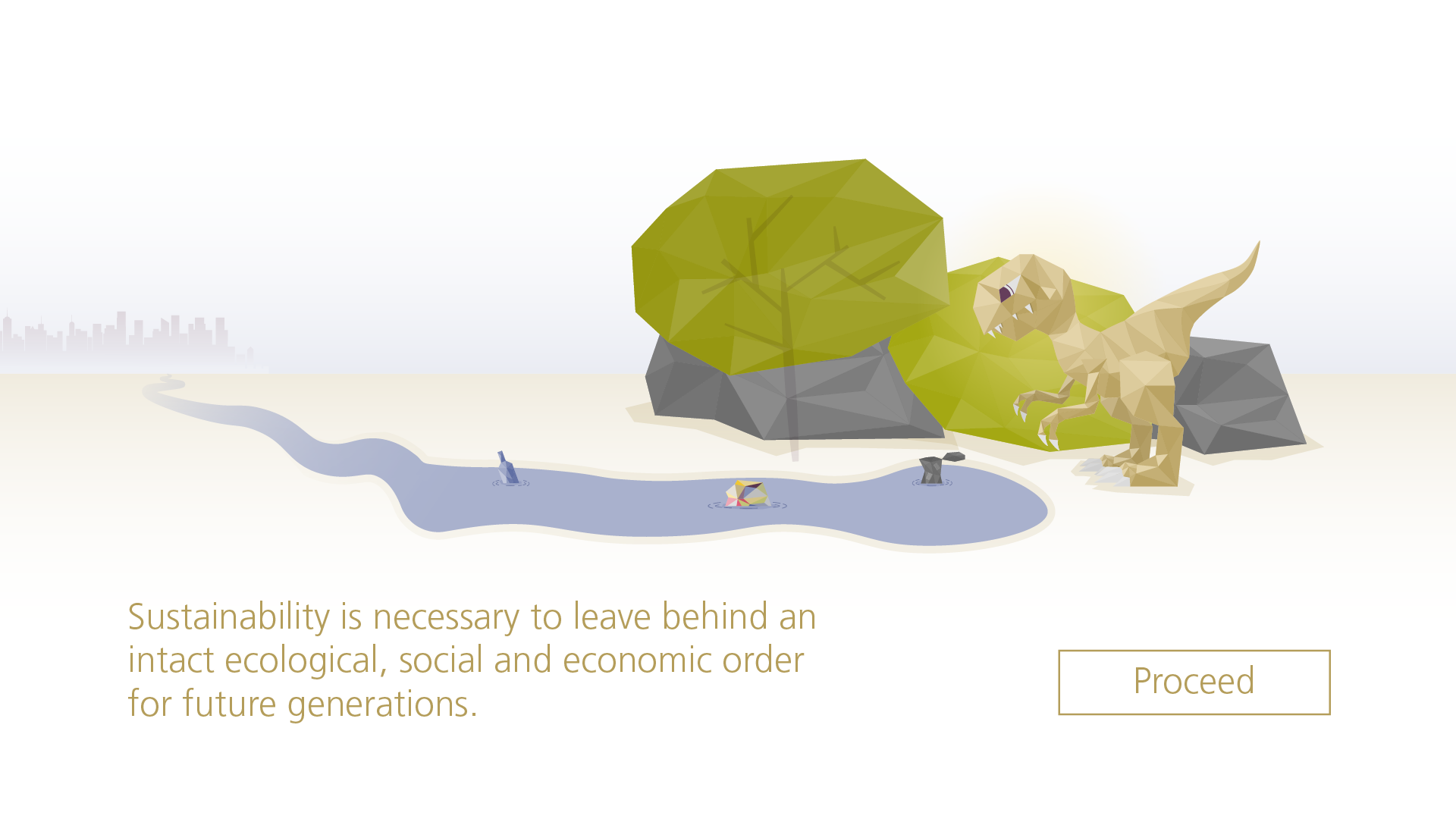
To support the narrative, the learner moves through a fictional landscape on a metaphorical path.
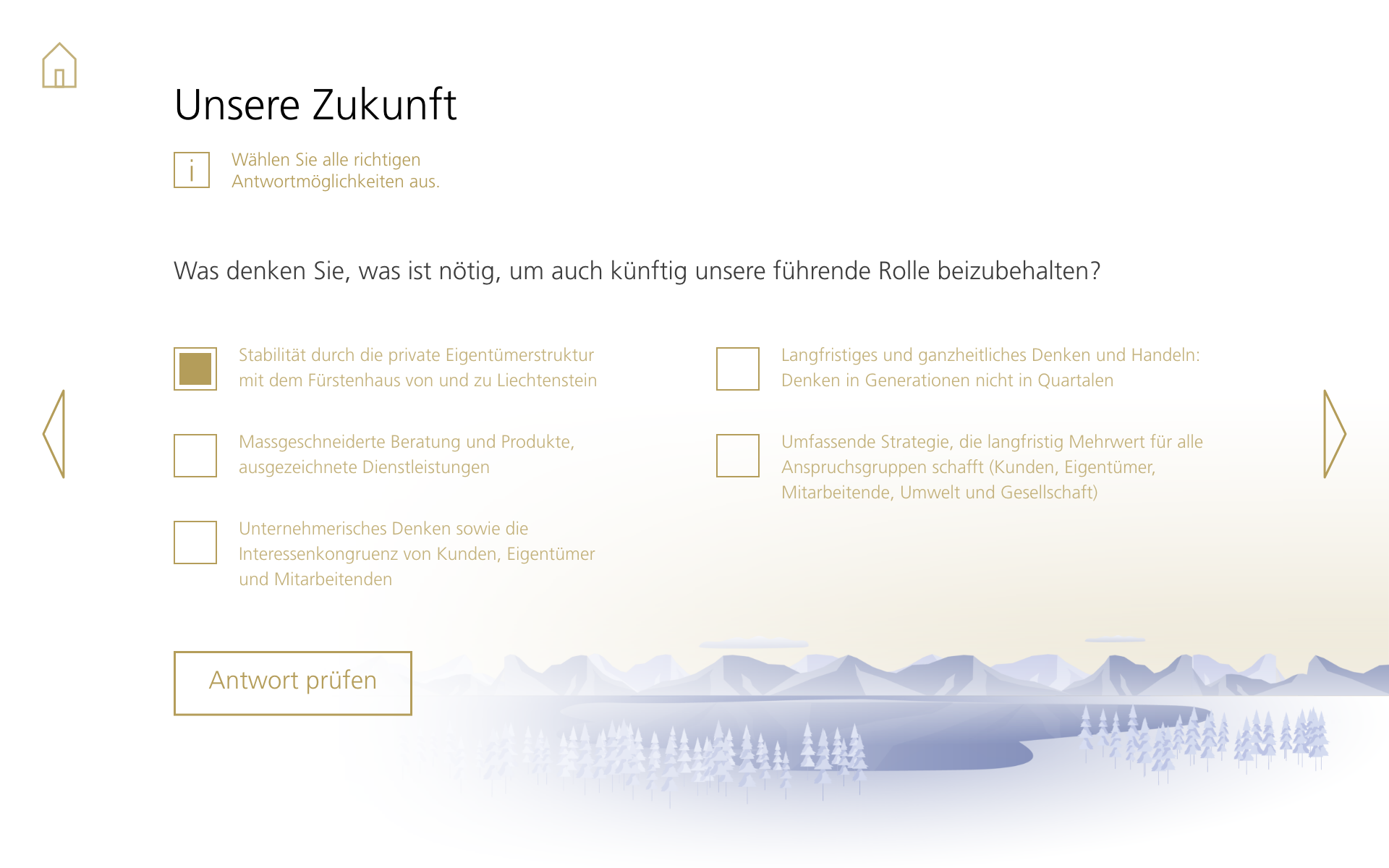
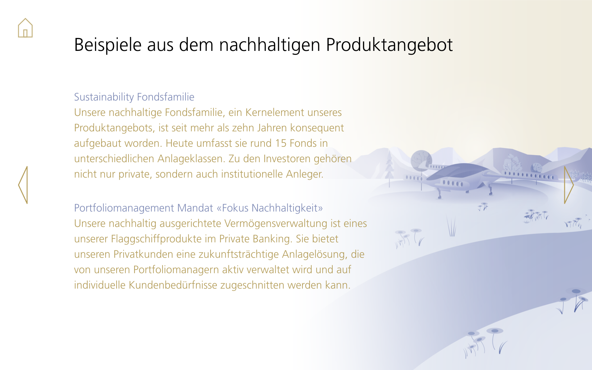
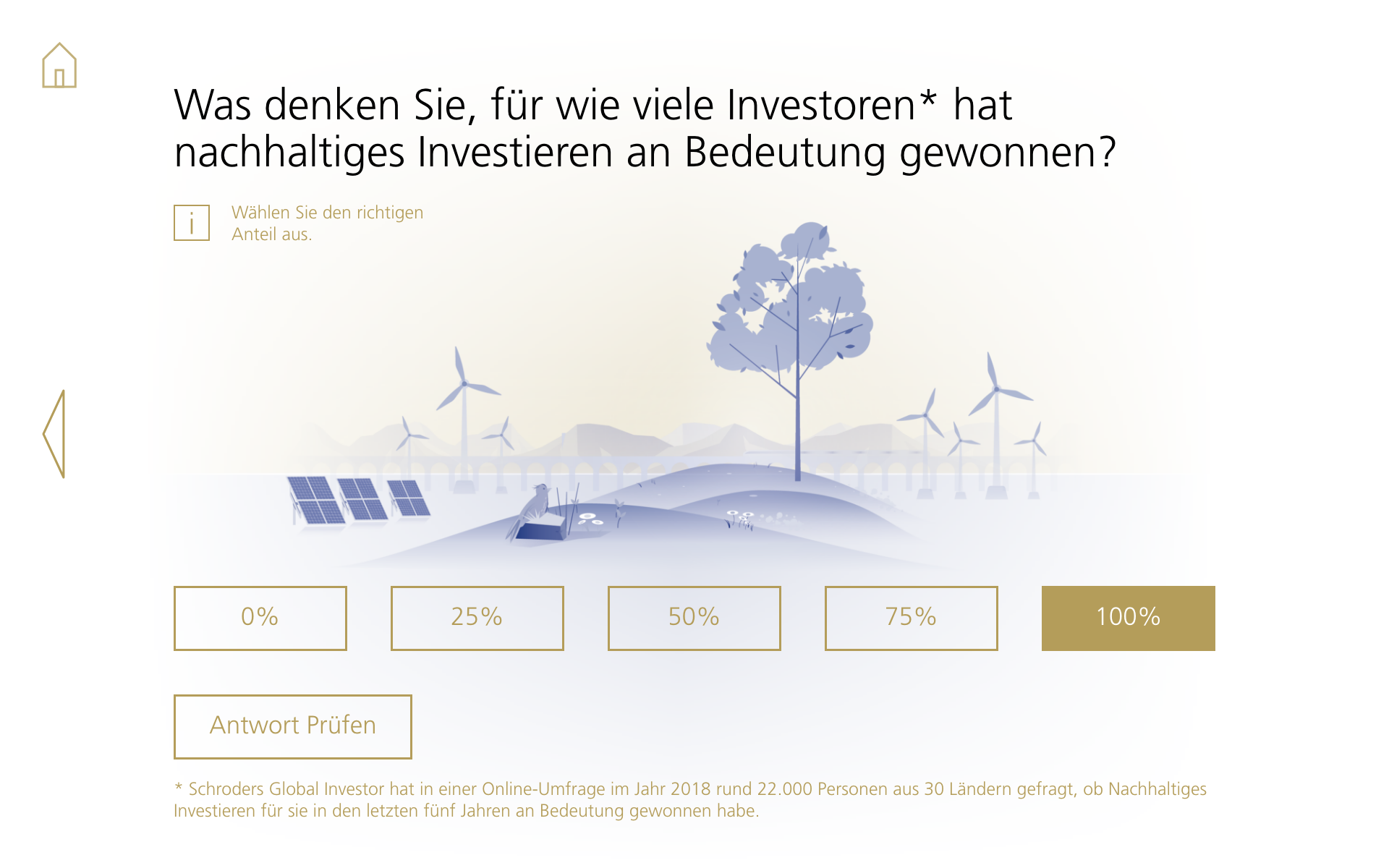
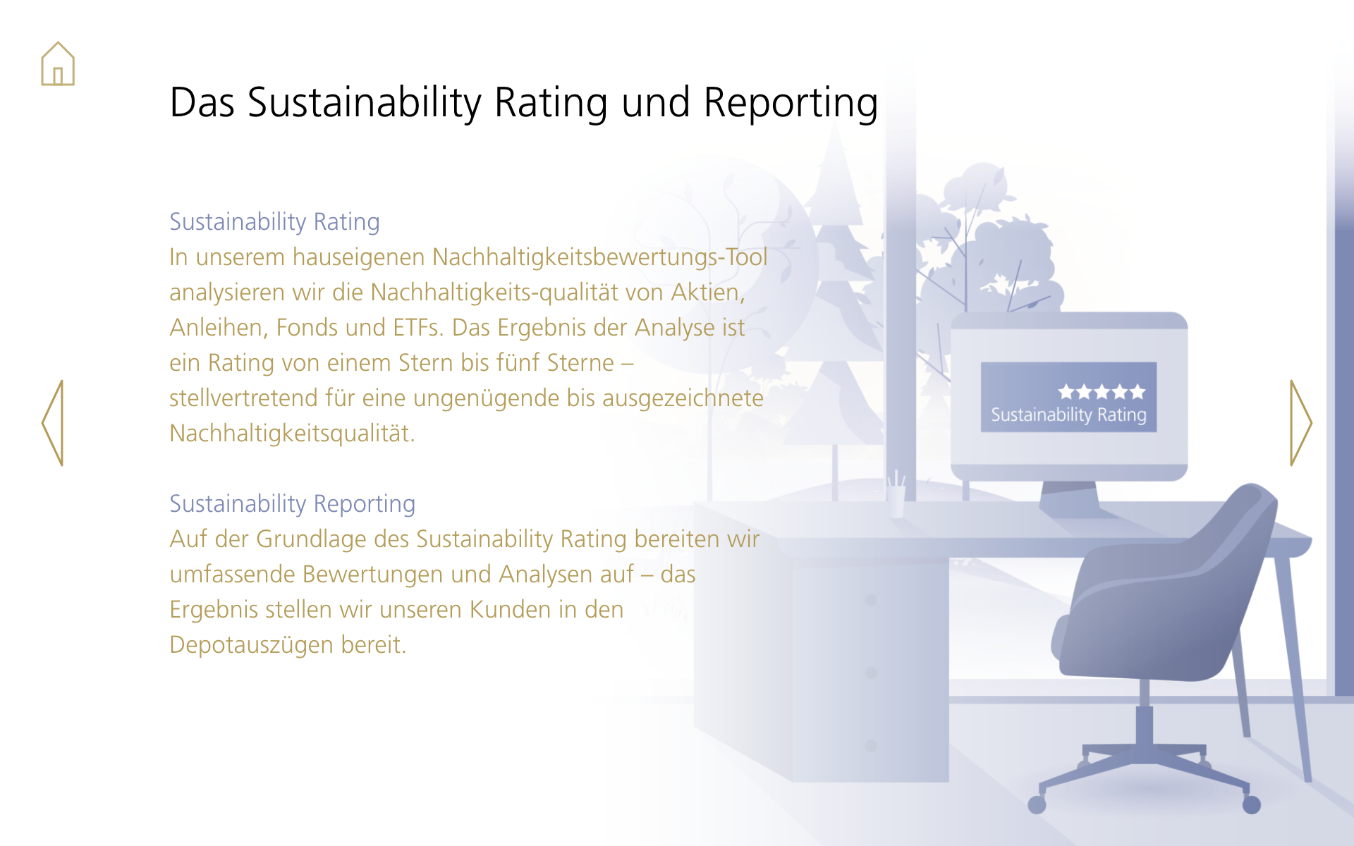
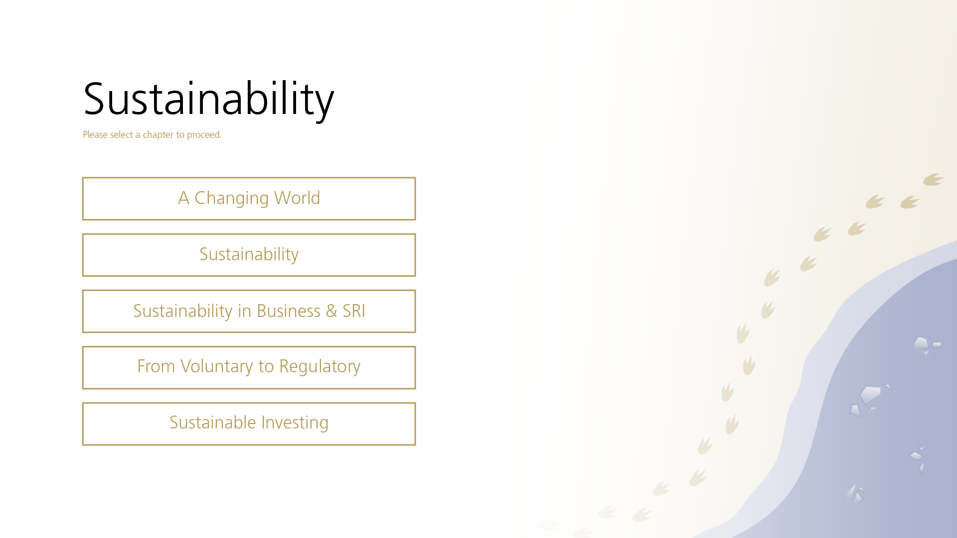
This path leads towards sustainable solutions, passing milestones, forward-thinking technologies, and the challenges of sustainability. In the company’s color scheme, the elements appear high-quality, and the use of ample white space makes the illustrations stand out and convey competence. The soft transitions are understated and provide more balance and calm in the composition. At the same time, the illustrations are closely linked to the training interface – both in content and arrangement. By using the company’s font and colors from the corporate design, the recognizability is further enhanced, subtly underscoring values such as tradition and trust.
Pitch
Before the actual project started, the project team from youknow won the client’s tender, among other things, with the following design created by me, standing out against other competitors:
Ein Projekt der youknow GmbH
